The Academy of Television Arts & Sciences recently presented the 2012-2013 Creative Arts Primetime Emmy Awards for programs and individual achievements at the 65th Emmy Awards presentation. The Emmy® Awards recognise excellence within various areas of television and emerging media. The Primetime Emmy Award is a symbol of peer recognition from over 15,000 Television Academy members, with each member casting a ballot for the category of competition in their field of expertise. As typography (and other arts related to the alphabet like calligraphy, lettering, graffiti, etc.) are the main focus of The FontFeed, I am of course interested in Outstanding Main Title Design amongst the myriad categories.
Below are this year's five nominees for the Emmy Awards 2013, with the winner at the end of the list. For additional information check the excellent Art of The Title article analysing the sequences.
American Horror Story: Asylum title sequence on YouTube
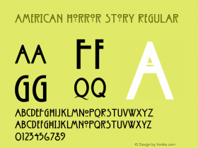
The opening title sequence for FX's American Horror Story: Asylum is again created by Prologue's Kyle Cooper of Se7en fame. It expands on last year's also nominated sequence for the original American Horror Story season. It's a continuation of the previous one, failing to do anything new with it. The type still is that cringe-worthy face inspired by Charles Rennie Mackintosh's signature Arts & Crafts display sans.
Da Vinci's Demons title sequence from HUGE on Vimeo.
Huge's Emmy Award-winning title sequence matches layered imagery with layered type – Trajan over an unidentified script(ural) face. Trajan makes some sense given the Renaissance period setting, yet I would have preferred an actual Renaissance design. The underlying typeface could be Civilité or even Da Vinci's own handwriting, but it's almost impossible to identify conclusively. The all caps sans serif with interesting alternates at the end is Dino dos Santos' Estilo.
Elementary title sequence from Simon Clowes on Vimeo.
Making a Rube Goldberg machine the central character in the title sequence for Elementary, the contemporary re-imagining of the Sherlock Holmes mythos for CBS, is a stroke of genius from Prologue. Square Slabserif 721 (Bitstream's digitisation of City) fits conceptually as a contemporary interpretation of the slab serifs that were at the height of their popularity in industrial UK of the late 19th, early 20th century.
HALO 4: Forward Unto Dawn opener from Polynoid on Vimeo.
Instead of using a typical LED or dot matrix design for the displays in their opening sequence for Halo 4: Forward Unto Dawn, Polynoid chose the more sophisticated letter forms of Agency, a mainstay in action movie typography. While the square shapes of this classic by Morris Fuller Benton still refer to screen typography, they suggest that screen resolution in the future will be fine enough to dispense with those crude grid-based fonts.
The Newsroom title sequence from Shine on Vimeo.
The typography in the title sequence by Shine for The Newsroom is a mishmash of neo-grotesques with Neue Helvetica headlining (sorry, couldn't resist ; ). Its predecessor Standard / Basic Commercial also makes a number of appearances. To be honest I find the choice of type as uninteresting as Art of the Title finds the actual title sequence. Television channels these days often have far more exciting typography, sometimes even bespoke typefaces.
Vikings title sequence from The Mill on Vimeo.
I am relieved that The Mill didn't fall into the trap of using some fake Celtic design for their title sequence for Vikings. The chiseled features of Friz Quadrata successfully evoke the weapons and armour of the Norse conquerors without being too literal, although I wouldn't have minded seeing the glorious Carter Sans – Matthew Carter's fairly recent collaboration with Dan Reynolds – perform the duties. Or Gerard Unger's contemporary classic Amerigo.