
Source: http://www.wemadethis.co.uk.License: Public Domain.
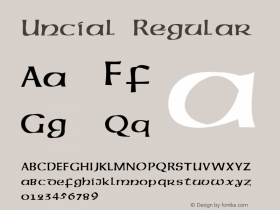
Albertus with a custom descending 'P' and 'G', as it is typical for uncial typefaces.
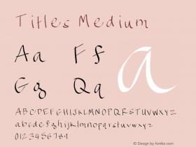
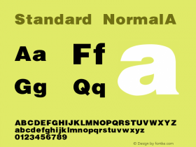
In the 1960s British TV show The Prisoner, an adapted version of Berthold Wolpe'sAlbertuswas used on everything from titles to signs and props. Many of these were hand rendered. The key adaptations were the removal of the dots from 'i's and 'j's, and 'e's that had an uncial feel to them — although occasionally standard 'e's snuck in too. I don't currently know who created all the signs, though the show's art director was a chap called Jack Shampan.

Source: http://www.wemadethis.co.uk.License: Public Domain.

Source: http://www.wemadethis.co.uk.License: Public Domain.

Source: http://www.wemadethis.co.uk.License: Public Domain.

Source: http://www.wemadethis.co.uk.License: Public Domain.

Source: http://www.wemadethis.co.uk.License: Public Domain.