I have said this numerous times over the past few years – now is a great time to be into typography. Typographic production is at an all-time high, digital font technology allows for unequalled typographic refinement, the general public has never been more aware of typography, and last year again a number of fascinating books on typography were released. One – quite literally – little publication stands out amongst them. Inside Paragraphs: Typographic Fundamentals is a typographic primer unlike any I have ever seen, written by Cyrus Highsmith, one of today's truly original voices in American type design.

Make-ready of the cover for Inside Paragraphs: Typographic Fundamentals. Photo courtesy of Cyrus Highsmith/Font Bureau
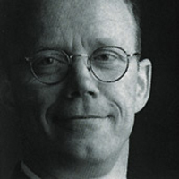
As Senior Designer at Font Bureau, Cyrus concentrates on the development of new type series at the renowned digital type studio founded by publication designer and media strategist Roger Black, and contemporary type design icon David Berlow. He is also a lecturer, a teacher, an artist, and an author. At 8.5" × 5.5" and 104 pages, Inside Paragraphs: Typographic Fundamentals is deceptively unassuming volume. The book is a brisk, pleasant read, yet encourages frequent revisiting. In a friendly and knowledgeable voice, Cyrus explains everything that goes on in a paragraph of text. He reveals the interrelationships between character, word, line and paragraph, all by focusing on the space between them. In doing so he effortlessly manages to cover all the fundamentals of typesetting. His delightful, subtly humorous illustrations are not merely an added bonus, but help clarify many a concept. I – virtually – sat down with the author for an interview.

Cyrus Highsmith
What made you decide to publish a primer on typography?
Cyrus Highsmith | "It was under pressure from Font Bureau's manager, Sam Berlow. For years, he overheard many of the conversations I had with our clients about paragraph settings, hyphenation, and justification. So Sam thought there was a need for it. And he knew that I had been developing a lot of similar content for my typography classes at the Rhode Island School of Design.
I was reluctant at first because I didn't think there was really room for another typography book. I was also intimidated by the idea of writing a book. However, over the years, as I refined my typography lectures into a set of more cohesive ideas, I began to think maybe I could write a book that could add something.
When I finally sat down at my desk, after I had made the decision to write this book, my first thought was, "I don't want to write a book about typography, I want to make a comic book about typography." And then I thought, "don't be silly, you can't make a comic book about typography." I start a lot of projects this way – thinking of how I can get out of doing what I'm supposed to.
Later, after a lot of work, I realized that if someone was going to make a comic book about typography, the book I made was actually a pretty good start."


Spreads from Inside Paragraphs: Typographic Fundamentals.
There already are a number of classic reference books on typography around, like Robert Bringhurst's Erik Spiekermann's Stop Stealing Sheep & Find Out How Type Works. Where would you situate your book?
Cyrus Highsmith | "Those are all excellent books. To me, The Elements of Typographic Style is sort of a manual for book typography. It's very detail-oriented and a great reference tool. Spiekermann's books are very good accessible overviews of general typographic knowledge with lots of great tips and tricks.
Inside Paragraphs goes really deep into what happens inside a paragraph of text. This is typography's foundation. My hope is that after you read my book, you can get more out of those other books. You'll be able see how all those details and rules in Bringhurst's book fit into the big picture and some of the reasoning behind them. And you'll better appreciate and take better advantage of Spiekermann's insights."


Spreads from Inside Paragraphs: Typographic Fundamentals.
Your approach is quite unique – you build your whole narrative around space, not the letters but the nothingness between them. Where did you get this idea?
Cyrus Highsmith | "There's a very direct relationship between my approach to letter drawing, my book, and my approach to teaching. When I draw letters or anything, I focus on the negative space. I've trained myself to do this but I also think it's what comes naturally to the way my eyes and brain work. This isn't unique though – negative space is a well-known basic concept in typography and graphic art.
In her influential book on art education, The New Drawing on the Right Side of the Brain, author Betty Edwards wrote, "Art teachers often laboriously teach their students 'the rules of composition' but I have discovered that if students pay close attention to the negative space, many compositional problems are automatically solved."
When I teach letter drawing, I have observed a similar phenomena. If the students can focus on drawing the empty space inside and around the letter, 90–95% of the issues of correct proportion, balance, and weight, get resolved. Then it is just a matter of making small refinements to the letters themselves.
When I teach typography I use a similar approach. Instead of trying to teach the students the rules of typography, I teach students to think of a paragraph in terms of the different kinds of empty spaces. And the same thing happens – many typographic problems are automatically solved.
I have never been good at following rules or understanding directions. I'm even worse at teaching rules and giving directions. But please don't misunderstand me. I care very much about the correct way to draw letters. I care very much about correct typography. I'm teaching a way to get those results. But I approach it in a visual way, by teaching the students to focus on the empty space and to look between things.
Maybe that's the new unique part of my book – that it explains typography in a very visual way."


Spreads from Inside Paragraphs: Typographic Fundamentals.
What kind of audience is your book intended for?
Cyrus Highsmith | "The book was intended specifically for my students at RISD. These are students in their very first typography class. However, this class is the first of many typography classes they will take while at RISD. Therefore my goal is not to teach them everything they need to know. It is to form a solid foundation that they can build on with further education and experience.
In addition, as I said earlier, Sam Berlow also pressured me to write this book because of the advice about type setting I was giving to clients. So I think there is evidence that the need for it goes beyond just students.
But as I write in the book's introduction, it's the book I wanted when I was just starting to study typography myself. So the audience is really me, 20 odd years ago."

Spread from Inside Paragraphs: Typographic Fundamentals.
What struck me is that you often refrain from giving hard rules and instead give gentle recommendations, advising "not too little, not too much, but just enough".
Cyrus Highsmith | "I was reading recently about the Nobel Prize winning scientist, Richard Feynman. OK, it was a comic book about him. Feynman was a physicist but he also thought a lot about how to teach physics, and a lot of his thinking appealed to me. He said, "You can know the name of a bird in all the languages of the world, but when you're finished, you'll know absolutely nothing whatever about the bird… So let's look at the bird and see what it's doing – that's what counts. I learned very early the difference between knowing the name of something and knowing something."
To apply this to typography, it doesn't matter if you know what a ligature is or how many typefaces you have memorized. What counts is if you can look at typography and see what it's doing. Especially at this moment.
It's an exciting time to be a typographer. Not only do we have all these amazing tools, we're at the beginning of all sorts of new formats and advances. And of course it's a mess.
This is why a strong typographic foundation is so critical. As a story moves from a magazine page to tablet screen to web browser and back, the story's typography needs a way to move with it. When the pages change size, columns expand or contract, as the resolution goes up and down, the typography, what goes on inside paragraphs and beyond, needs to be carefully adjusted to suit the context.
Why is this important? Because typography is part of the story. Going forward, our struggle as typographers is to make sure publishers and readers don't forget this."

Cyrus Highsmith in his workspace.